
A Story of Design, Performance, and a $50 Tip for Perfect Execution
In the world of web design, every project is an opportunity to create something that not only looks great but also performs flawlessly. That’s exactly what happened when I worked on MuscleUp, an Australian fitness brand known for its high-quality protein products.
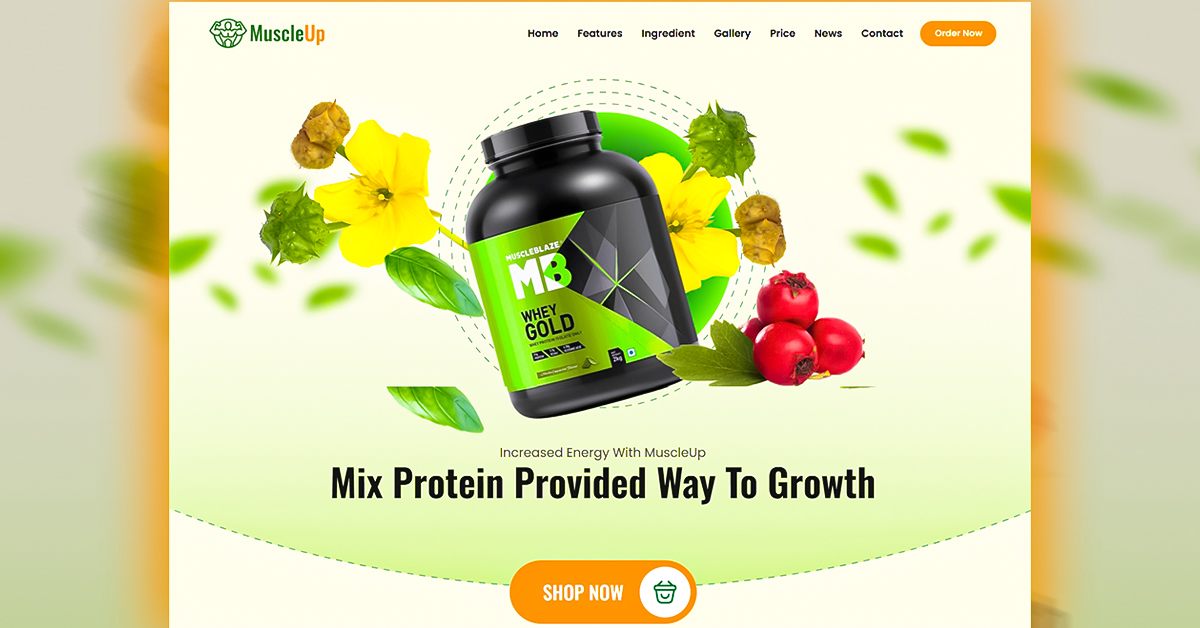
The client wanted a conversion-focused landing page to showcase their main protein box product — a clean, modern design that could attract fitness enthusiasts and boost sales.
When I delivered the final version, the client loved it so much that they gave me a $50 tip as appreciation for the work. Here’s the full story behind this rewarding project.
🏋️ Understanding MuscleUp’s Vision
MuscleUp is a fitness and supplement brand that focuses on providing premium protein boxes and other health products for athletes and gym lovers.
The client’s main goal was to:
- Create a high-converting landing page for their top protein product.
- Highlight five product variations clearly and attractively.
- Add a simple yet effective contact form for quick customer inquiries.
- Ensure the design looked modern, professional, and trustworthy — something that speaks to the fitness audience.
The brief was clear: “We need a landing page that’s powerful, clean, and makes people want to buy.”
💡 The Challenge
Fitness websites often look cluttered or overly aggressive. The challenge was to design a page that felt energetic but still elegant, with visuals and copy that inspire confidence and action.
Plus, this being an international client project, I needed to ensure the layout, fonts, and overall structure matched global design standards and mobile responsiveness for users across devices.
💻 The Process: Building with WordPress + Elementor
To deliver a pixel-perfect landing page quickly, I chose WordPress with Elementor — the perfect combination for visual creativity and flexibility.
Here’s how I built the page:
1. Design & Color Scheme
I used a dark and energetic theme — with bold fonts and high-contrast visuals to match the brand’s strong and athletic identity. The page instantly gives off a powerful fitness vibe.
2. Hero Section That Converts
The first section included a high-quality protein box image, a short benefit-driven headline, and a clear call-to-action button to drive immediate engagement.
3. Product Display
I showcased five products — each listed with clean visuals, short descriptions, and an easy layout that keeps users focused.
4. Simple Contact Form
I created a minimal contact form that looks professional and easy to use. It helps potential buyers connect quickly without distractions.
5. Mobile Optimization & Speed
The landing page was fully responsive and lightweight, ensuring fast load times — a crucial factor for international users.
⏱️ Timeline
The entire landing page project was completed in just a few days, including design, testing, and revisions. Clear communication with the client helped ensure everything went smoothly from start to finish.
🚀 The Result
The final MuscleUp landing page turned out clean, modern, and conversion-driven — exactly what the client wanted.
When I shared the final version, the client’s reaction was priceless — they were thrilled with the outcome and even sent me a $50 tip as a thank-you for the quality and creativity of my work.
This project became one of my favorites because it combined design excellence, client satisfaction, and a focus on performance.
🧰 Tools & Technologies Used
- WordPress CMS
- Elementor Page Builder
- Responsive Design Techniques
- Lead Generation Contact Form
- On-page SEO Optimization
- Image Optimization for Speed
🌍 Impact
The new landing page gave MuscleUp a professional digital presence that helped them attract customers across Australia. It not only showcased their products beautifully but also established them as a serious player in the fitness market.
💬 Final Thoughts
Working with MuscleUp was a powerful reminder that good design speaks louder than words.
From concept to completion, the project reflected clarity, strength, and simplicity — everything the brand stands for.
And that $50 tip?
It wasn’t just a bonus — it was proof that when you mix passion, skill, and attention to detail, clients notice.